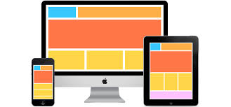
Is your website hard to use on your phone? Many people now use their phones to browse the internet. If your site doesn’t work well on phones, people get annoyed. This also hurts your search engine ranking. A bad mobile experience will push visitors away. A responsive website ensures your site adapts to different screen sizes, providing a smooth experience for all users.
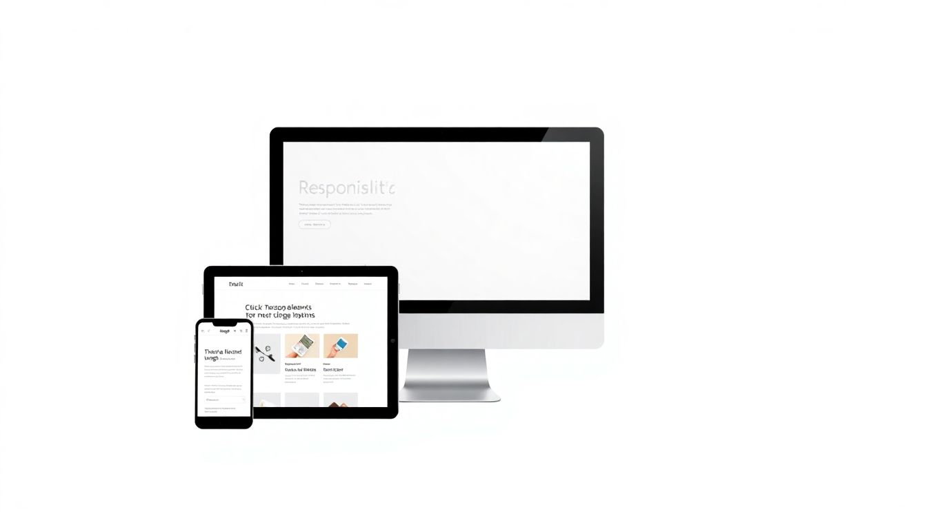
Wouldn’t it be great if your website looked good on any device? Responsive Website design is the answer. It makes your site change based on the screen size. This guide will show you how to create a responsive website, step by step.
Responsive design improves user experience. It also boosts your SEO and helps you get more customers. Let’s get started.
1. Understanding the Fundamentals of Responsive Web Design
Responsive web design is key. It makes sure your website works well on every device. This includes phones, tablets, and computers. It’s all about making your site flexible.
What is Responsive Web Design?
Responsive web design changes the layout of your website. It adjusts based on the device being used. The site recognizes the screen size. Then, it adapts to fit the screen. This provides a good user experience.
Imagine a website that is hard to read on your phone. The text is too small. The buttons are too close together. A responsive website fixes this. Elements resize and rearrange. This makes it easy to use on any device.
Key Principles: Fluid Grids, Flexible Images, and Media Queries
There are three main parts to responsive design. These are fluid grids, flexible images, and media queries. Each part plays an important role. They work together to create a responsive website.
- Fluid Grids: Instead of using fixed sizes, fluid grids use percentages. This allows the layout to stretch and shrink. It fits different screen sizes.
- Flexible Images: Flexible images also scale with the screen. They don’t break the layout. This is done by setting a
max-width. - Media Queries: Media queries apply different styles for different screens. You can target specific devices. This can be based on screen size.
The Mobile-First Approach
Consider designing for mobile first. This method focuses on phones first. Then, it scales up to bigger screens. This helps you prioritize what’s important. It also ensures a clean experience.
Starting with mobile keeps your site simple. Then, you add features for bigger screens. This leads to a better user experience. A streamlined mobile experience is a great way to start.
2. Setting Up Your Development Environment and Project Structure
Before you start coding, set up your work area. This makes coding easier. It also keeps your files organized. It all starts with choosing the right tools.
Choosing a Code Editor
A code editor is where you write your code. There are many options available. VS Code, Sublime Text, and Atom are popular. They offer features like syntax highlighting. This helps you write cleaner code.
These editors also have extensions. These add extra features. Choose an editor that fits your coding style. Most are free to use.
Structuring Your Project Folders
Organize your project files into folders. This keeps everything neat. Create folders for HTML, CSS, JavaScript, and images. This makes it easier to find what you need.
Use clear and consistent names. Name your files something obvious. For example, use style.css for your CSS file. Keeping things tidy saves time.
Setting Up a Basic HTML Template
Start with a basic HTML template. This gives you a starting point. Include the viewport meta tag. This tag is important for responsive design.
<!DOCTYPE html>
<html lang="en">
<head>
    <meta charset="UTF-8">
    <meta name="viewport" content="width=device-width, initial-scale=1.0">
    <title>Responsive Website</title>
    <link rel="stylesheet" href="css/style.css">
</head>
<body>
    <div class="container">
        <h1>Hello, Responsive World!</h1>
    </div>
</body>
</html>
The viewport meta tag controls scaling. It makes sure your page looks right on devices. This is very important for responsive sites. Add this tag to every HTML file.
3. Implementing Fluid Grids for Flexible Layouts
Fluid grids are the backbone of a responsive website. They allow your content to resize. It adjusts to different screen sizes. CSS Grid and Flexbox are two methods. Use them to create fluid grids.
Understanding CSS Grid and Flexbox
CSS Grid and Flexbox are powerful layout tools. They help you build responsive designs. Each one has its strengths. They are useful in different situations.
CSS Grid is for two-dimensional layouts. It handles rows and columns. Flexbox is for one-dimensional layouts. It is useful for aligning items.
Building a Basic Fluid Grid with CSS Grid
Here’s how to create a basic fluid grid using CSS Grid:
.container {
    display: grid;
    grid-template-columns: repeat(auto-fit, minmax(250px, 1fr));
    gap: 20px;
}
This code creates a grid. It has columns that are at least 250px wide. They expand to fill the available space. The fr unit divides the space evenly.
Creating a Fluid Grid with Flexbox
Here’s how to create a fluid grid with Flexbox:
.container {
    display: flex;
    flex-wrap: wrap;
    justify-content: space-between;
}

.item {
    flex-basis: calc(50% - 10px); /* Two items per row */
}
This code uses Flexbox to wrap items. Items will wrap to the next line. This happens when they run out of space. flex-basis sets the initial size of each item.
4. Handling Images and Media Responsively
Images and media need to be responsive, too. They should scale properly. They also need to load quickly. This improves the user experience. There are many ways to optimize your media.
Using Flexible Images with max-width
The max-width property makes images flexible. It allows them to scale down. But, it doesn’t let them stretch too big. This keeps images within their containers.
img {
    max-width: 100%;
    height: auto;
}
This CSS code makes all images flexible. They will scale down to fit their containers. The height: auto keeps the aspect ratio.
Using the <picture> Element for Art Direction
The <picture> element gives you more control. It lets you serve different images. This can be based on screen size. This is useful for art direction. It makes sure the right image is displayed.
<picture>
  <source media="(max-width: 600px)" srcset="image-small.jpg">
  <source media="(max-width: 1200px)" srcset="image-medium.jpg">
  <img src="image-large.jpg" alt="A responsive image">
</picture>
This code displays different images. It does this for different screen sizes. The browser chooses the best image. It uses the media queries.
Optimizing Images for Performance
Optimizing images speeds up your site. Use optimized formats like WebP. Compress images to reduce file size. Smaller images load faster. This improves the user experience.
Tools like TinyPNG can compress images. They do this without losing quality. Use a CDN to deliver images quickly. CDNs store images on servers around the world.
5. Utilizing Media Queries for Targeted Styling
Media queries apply different styles. They do this based on screen size and device. This is how you create a responsive design. Target specific devices and screen orientations.
Writing Effective Media Queries
Media queries use min-width and max-width. These target specific screen sizes. Write media queries in your CSS file. These apply styles for different breakpoints.
/* Mobile Styles */
body {
  font-size: 16px;
}

/* Tablet Styles */
@media (min-width: 768px) {
  body {
    font-size: 18px;
  }
}

/* Desktop Styles */
@media (min-width: 1200px) {
  body {
    font-size: 20px;
  }
}
This code changes the font size. It is based on the screen size. Use media queries to adjust your layout. Tweak typography and colors as needed.
Defining Breakpoints for Different Devices
Breakpoints are points where your design changes. Common breakpoints are for mobile, tablet, and desktop. Choose breakpoints that fit your content.
- Mobile: Up to 767px
- Tablet: 768px to 1199px
- Desktop: 1200px and up
These are common breakpoints. Adjust them to fit your design. Test your design at different screen sizes.
Testing and Debugging Media Queries
Test media queries with browser tools. Open the developer tools. Then, use device mode. This lets you see how your site looks. This is on different devices.
Check your media queries carefully. Make sure they apply correctly. Use the console to find errors. Testing ensures a good user experience.
6. Testing and Optimizing Your Responsive Website
Testing is important. It ensures your site works well. It works on all devices. Optimization makes your site faster. It also makes it more accessible.
Cross-Browser and Cross-Device Testing
Test your site on different browsers. These include Chrome, Firefox, and Safari. Also, test on different devices. Use phones, tablets, and desktops.
Browser developer tools help you test. Online tools like BrowserStack also help. They let you test on many devices.
Performance Optimization Techniques
Optimize your website for speed. Minify CSS and JavaScript files. This removes unnecessary characters. This reduces file sizes.
Leverage browser caching. This stores files on the user’s computer. This speeds up loading times. Use a content delivery network (CDN). CDNs deliver files from servers around the world.
Accessibility Considerations
Accessibility is very important. Make sure your site is usable. It should be for everyone. This includes people with disabilities.
Use semantic HTML. Provide alt text for images. This helps screen readers. Ensure your site is navigable with a keyboard. Test with accessibility tools.
Conclusion
Creating a responsive website improves user experience. It helps with SEO. Plus, it boosts conversions. This guide has given you the steps. You can now build your own responsive site.
Start with the fundamentals. Then, create fluid grids and flexible images. Use media queries for targeted styling. Remember to test and optimize your site. This helps you. You’ll create a great experience for all users. Now go build something amazing!